I like obsessing about things. One of the things I absolutely love to obsess is fonts. So since I installed this blog, I was constantly ticked off how badly PT Sans was rendered on Linux. I ended up replacing it with Cantarell, a very beautiful sans-serif font. The criticism section in Wikipedia is is from a single, not very convincing source, and, as I write in my blog posts in latin script, it doesn’t seem to apply to me. But why stop there?
Due to Google Web Fonts, and the ability to inject anything via JavaScript, I started changing fonts and comparing them on different systems. So I tried Chrome on Mac OS X and Firefox on Arch Linux.
More or less default
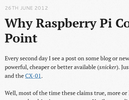
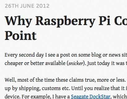
The first image was a shot of the status quo, with PT Serif and Cantarell on Arch Linux with Firefox (default GNOME3 font rendering). Generally I like the look and with the default sidebar font replaced by Cantarell it looks decent. PT Sans used to look very pixelated at that size. Click the image to see the whole screen.
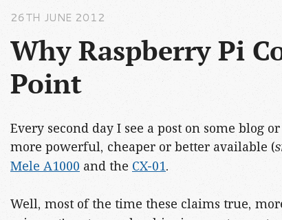
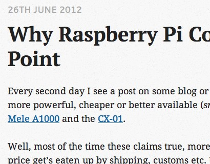
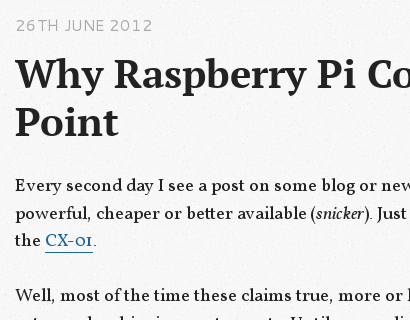
As interesting first observation, Mac fonts seem to be generally more bold and especially on straight lines a bit blurry. I also got a comment that it looks narrow.
Droid Family
The Droid fonts were made by Google for good screen legibility and it shows. Honestly, this is a pretty fine font and I use the monospace variant as programming font (and DejaVu Monospace as console font) because it just works. Not surprising given Droid is, like DejaVu, derived from the excellent Bitstream Vera font family. My only complaint is that it is boring.
One of my testers liked this one the most. Not sure whether it was because he’s a Google fanboy or because of the honestly good font; I wasn’t able to do proper double blind testing.
Gentium
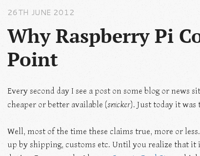
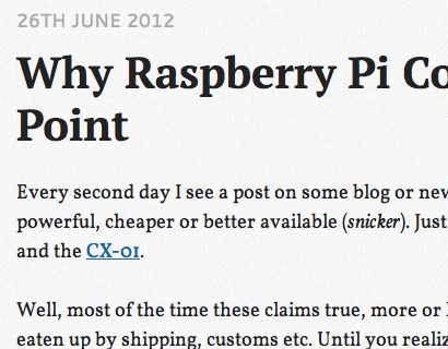
The first time I saw Gentium, I fell in love, because I thing the glyphs look wonderful. Unfortunately, it is not really a screen font as the Linux shot shows. When I started using it in my documents, it turned out it is not a document font either, because unlike the excellent Linux Libertine it does not work. It looks way to fidgety on paper and just awful on screen.
On Mac it looks quite ok although a bit hard to read at that size (16px, Octopress default). One of my testers’ favorite, although due to the abysmal rendering on Linux I couldn’t live with it.
Vollkorn & Yanone Kaffeesatz
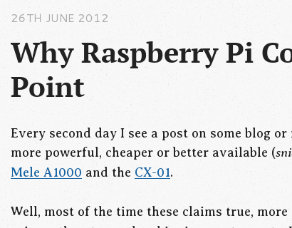
I usually hate the “Vollkorn” font. It completely falls apart at smaller sizes so I just included it to make fun of it. Everytime I see it, it looks awful, on the site I saw it first, on the creators site. The glyphs are fuzzy and not uniformly thick. Unless you increase the size, then it starts looking actually quite decent to the extent that I liked it quite a bit. In this size, it looks quite similar to PT Serif but better. There’s a number of tiny details that make it nice, I especially like the “old style” numbers. The underline is quite far from the text it underlines, maybe a bit too far but overall still bearable.
The font on the sidebar is “Yanone Kaffeesatz”, a free font that got quite famous. After testing it, I consider it useless for text. It is a decorative font, maybe useful for page headers but not really up for the sidebar, for example.
Averia
This one is basically the odd one out. Averia is a font that is the average of other fonts and while at this, it looks “interesting”. I tried using it on the blog the first time I saw it, until I realized that it doesn’t work either. One of my testers stated in a blind test this looks like a fun font (similar to Sans Serif), which is actually quite true. While Averia Serif looks kinda too bold and smudgy, Averia Sans is just broken on Mac and on Linux even more.
Conclusion
Designing fonts is hard and it shows when looking how differently fonts are rendered on different operating systems and sizes. At least nowadays we have a good selection of high quality system fonts like Droid or Cantarell (and the Ubuntu font is fine as well). For the web it is still kinda hard to find a font that “works”. I heard things look different on Windows, but I did not have a system available to test.
Personally, I’ll go with the combination of Vollkorn and Cantarell now.
